


This project investigates public transportation accessibility and efficiency in Buenos Aires, Argentina. Using Python and the pandas library, the analysis identifies peak usage patterns, defines high-traffic thresholds using statistical quantiles, and compares performance across the city's subway network (Subte).
The analysis is divided into three distinct phases: Data Structures, Sorting & Filtering, and Descriptive Statistics.

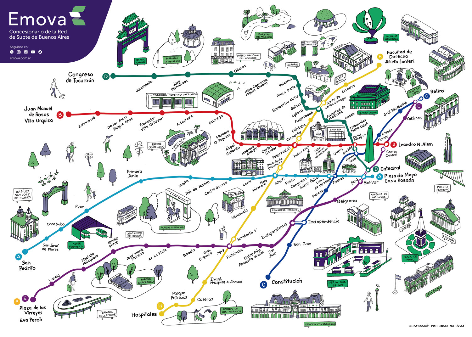
The foundation of the project focuses on the Pueyrredón Station (Line D), establishing the move from manual grid management to high-performance data manipulation.
-
Step 1: Data Ingestion: Importing raw CSV data into a Pandas DataFrame. This leverages vectorized operations, allowing for mathematical calculations across the entire dataset simultaneously.
-
Step 2: Dataset Inspection: Utilizing method like
.info()to perform a data audit, ensuring type consistency and identifying any null values. -
Step 3: Feature Selection: Simplifying the dataset by selecting specific columns (
datetime,pax_total, etc.) and removing redundant features to optimize memory usage. -
Step 4: Revenue & Payment Analysis: Calculating column-wide sums to quantify how different payment types (full fare vs. discounts/passes) contribute to the total ridership.
- Strategic Logic: This identifies the revenue impact of discounted rates for that month, translating transit volume into financial insights.
-
Step 5: Distribution Analysis: Generating a histogram of total passenger counts.
- Strategic Logic: Using
bins=40allows for a granular look at the data. This reveals a skewed distribution, showing that while the station is quiet most of the time, it handles intense, short-lived spikes during commute hours.
- Strategic Logic: Using

-
- Purpose: The chart shows that most recorded hours had relatively low passenger counts, while high-traffic peak moments were much less frequent. It groups the passengers into 40 specific ranges (bins) to provide a detailed view of ridership density.
- X-Axis (Horizontal): Represents the volume of passengers per hour. The left side shows quiet periods, while the right side shows extreme rush hour peaks.
- Y-Axis (Vertical): Represents the frequency, or how many hours in the dataset fell into those specific passenger ranges.
- The Findings: The data shows a right-skewed distribution. Most hours fall in the lower volume range (tall bars on the left), confirming that the subway system operates at "extreme load" for only a small percentage of its total operating time.
In this phase, we expand the analysis to the entire city network to identify where resources—such as train cars and security—are most needed.
-
Step 1: Global Sorting: Ranking the dataset by
lineandpax_TOTALto instantly surface the most congested segments of the network. -
Step 2: Sub-Line Filtering: Isolating Line E to perform a deep-dive analysis on its specific traffic patterns.
-
Step 3: Data Slicing: Reducing the dataset to the Top 500 records to focus exclusively on "Peak Load" events.
-
Step 4: Rush Hour Identification: Plotting the
hourfeature for the busiest subset.- The Insight: The analysis identified a critical afternoon rush window between 16:00 and 18:00, pinpointing 6 specific stations that require the most attention during these hours.

-
- Purpose: By focusing on the top 500 records, we identify the specific times of day that consistently produce the highest passenger volumes.
- X-Axis (Horizontal): Represents the hour of the day (from 0 to 23). By using 24 bins, each bar represents exactly one hour of a full day cycle.
- Y-Axis (Vertical): Represents the frequency of extreme events. It counts how many times a specific hour appeared in the list of the 500 most crowded records.
- The Findings: The chart typically reveals Bimodal Peaks. You will see two distinct tall bars or "humps"—one in the morning (around 8:00 AM) and one in the late afternoon (between 16:00 and 18:00). This confirms the standard commuter "Rush Hour" pattern.
The final phase models the system's behavior under "extreme conditions" to help stakeholders plan for the highest possible demand.
-
Step 1: Quantile Filtering: Using
.quantile(0.95)to define "Extreme Traffic."- Strategic Logic: Infrastructure is built for peak capacity, not averages. This isolates the top 5% of all traffic events in the month.
-
Step 2: Descriptive Statistics: Calculating the
mean,median,standard deviation, andmaximumfor the high-traffic subset (df_95q) to quantify the stress on the network. -
Step 3: Plotting Station Counts: Generating a bar chart of the stations most frequently appearing in the 95th percentile. This identifies which stations are the "consistent outliers" in the system.
- The Findings: This chart highlights the Critical Hubs. Even if many stations are busy, a few specific stations (like Constitución) will have significantly taller bars. This tells stakeholders exactly where to prioritize physical infrastructure upgrades, such as wider platforms or additional turnstiles.

-
- Purpose: It isolates the stations that most frequently exceed the 95th percentile ridership threshold.
- X-Axis (Horizontal): Lists the Subway Stations. Usually, this is limited to the "Top 10" to keep the visual clear and actionable.
- Y-Axis (Vertical): Represents the event count. It shows how many times that specific station experienced a "95th percentile" traffic event during the month.
-
Step 4: Statistics per Station: Calculating the mean ridership segmented by individual station to identify the average "peak load" per location.
-
Step 5: Multi-Feature Segmentation (Pivot Tables): Utilizing
pivot_table()to compare Hour vs. Subway Line.- The Discovery: This revealed that while most lines follow a standard workday curve, Line E encounters high passenger counts well into the night (hours 21 and 22), identifying a unique demographic of late-night commuters.
| hour | A | B | C | D | E | H |
|---|---|---|---|---|---|---|
| 5 | nan | nan | 1738.74 | nan | nan | nan |
| 6 | 1281.29 | 1296.31 | 5499.08 | nan | nan | nan |
| 7 | 1866.11 | 2807.43 | 5617.16 | 2317.27 | 1423.5 | 1918.88 |
| 8 | 1863.7 | 2611.43 | 6060.87 | 2534.12 | 1397.31 | 1740.25 |
| 9 | 1675.23 | 2120.98 | 4246.31 | 1864 | nan | 1315.36 |
| 10 | 1391.35 | 1378.29 | 2690.5 | 1362.75 | nan | nan |
| 11 | 1432.29 | 1312.25 | 2639.86 | 1309.38 | 1835 | nan |
| 12 | 1573.41 | 1324.88 | 2192.37 | 1536.67 | 2023.54 | nan |
| 13 | 1710.46 | 1350.28 | 2507.52 | 1436.3 | nan | nan |
| 14 | 1484.47 | 1216 | 2156.58 | 1296 | nan | nan |
| 15 | 1420.22 | 1298.1 | 2047.02 | 1556.57 | 1357.67 | nan |
| 16 | 1608.28 | 1428.19 | 2303.65 | 1713.17 | 1463.85 | 1275.6 |
| 17 | 1935 | 1620.21 | 2274.91 | 1953.74 | 1653.2 | 1276.73 |
| 18 | 1712.04 | 1515.16 | 2025.16 | 1684.82 | 1405.47 | 1264.89 |
| 19 | 2372.67 | 1392.33 | 1522.82 | 1445.33 | nan | nan |
| 20 | 1689.5 | 1273 | 1315.08 | 1224 | nan | 1275 |
| 21 | nan | nan | nan | 1560 | 1570.71 | nan |
| 22 | nan | nan | nan | nan | 1333.5 | nan |
- Vectorized Data Operations: Improving performance over basic Python lists.
- Statistical Thresholding: Identifying peak loads via quantiles.
- Multi-Dimensional Analysis: Segmenting data through
.groupby()and.pivot_table(). - Data Visualization: Using histograms and bar charts to translate raw logs into actionable urban insights.
🧠 Strategic Takeaway: The "Hidden State"
This project demonstrates a professional transition from the visible grids of spreadsheets to managing a program's Hidden State. By leveraging the memory of the computer, I can process millions of rows at high speeds, maintain a traceable "audit trail" of all transformations, and build scalable tools applicable to any urban transit system worldwide.
- Clone this repository.
- Install dependencies:
pip install pandas matplotlib. - Open
Buenos Aires Subway.ipynband run the cells sequentially.
This analysis was developed as part of the Python for Data Analytics course by DeepLearning.AI on Coursera. It focuses on using discrete distributions to solve predictive problems in media and entertainment.
Data Analyst | Former EdTech Co-Founder
- 7+ Years of experience in business operations, strategic growth, and entrepreneurial leadership.
- I specialize in bridging the gap between raw data and high-stakes business decisions.
- My goal is to help organizations move beyond "gut feeling" to drive growth through evidence-based strategy.